Вы пытаетесь выбрать регион другой версии сайта. В случае перехода, вам придется набирать товары в корзину заново.
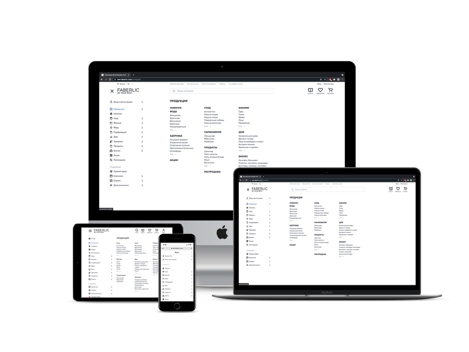
Новое «бургер»-меню»
Искать продукцию на мобильной версии сайта стало проще и удобнее – теперь все товарные категории доступны в один клик! Для удобства переключения мы доработали десктопную версию меню, и сейчас «бургер»-панель» открывается во весь экран.
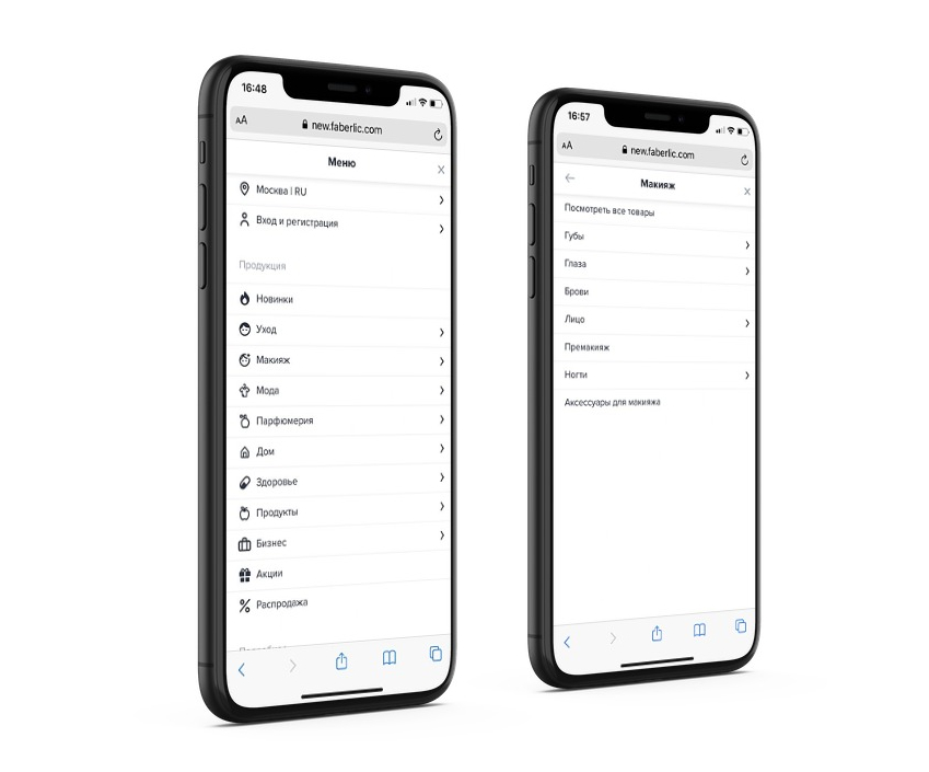
Удобная навигация
Мы максимально облегчили путь пользователя, уменьшили число переходов и убрали лишние вкладки и неиспользуемые блоки. Теперь перемещаться между разделами в мобильной версии можно с помощью специальных элементов навигации. Меню стало лаконичным и простым в использовании. Мы также доработали его структуру.
Визуализация разделов
Мы добавили иконки к основным разделам меню – визуализация категорий помогает быстро найти раздел и интуитивно выбрать в нём нужное. Меньше времени на поиск – больше на приятные покупки!
Адаптивность
Мы адаптировали интерфейс под любые типы устройств. Навигация сайта стала одинаково удобной на телефоне, ноутбуке и планшете.
С уважением,
Команда Faberlic